A figure can be beautiful at full resolution and useless when it is squeezed into a narrow column. This is a fixture for the second case: the values are invented, and the point is to see whether they remain legible.
Use labels that carry meaning
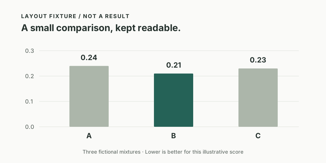
The bars below use short labels and a clear zero baseline. The caption tells a reader what they are looking at before they have to decode the page around it.
Keep data available in text
| Fictional mixture | Value | Interpretation |
|---|---|---|
| A | 0.24 | A layout fixture |
| B | 0.21 | A layout fixture |
| C | 0.23 | A layout fixture |
The table should be readable even when images are unavailable. It should also remain usable with a keyboard.
A second image with a different shape
The second figure tests a much wider aspect ratio. There is no crop and no automatic animation. Its job is to sit comfortably in the reading flow.
What to check
Resize the window, switch themes, open an image, close it with Escape, and return to the paragraph. An interaction is successful when the explanation remains easy to follow.